Picking A Thread Color
Trace Creek Quilting has over 200 thread colors in the studio to use on your quilts. Our overall philosophy is to compliment your quilt top with just the right panto and thread color without distracting from how beautiful it already is. Finding that balance can take some practice but with the thoughts below, we have the right tools to picking a thread color that accomplishes that goal to everyone’s satisfaction.
Neutral Thread Colors
Some longarmers only offer basic colors such as white, off-white, and grey. While I offer much more, it’s worth noting they offer such a limited pallet because it truly can work with any quilt. Occasionally a customer will request something neutral when I might have encouraged them to use more color, and I’m always reminded that it still looks great and still works just fine. I think that’s a great thing to always keep in the back of our heads when picking a thread color.
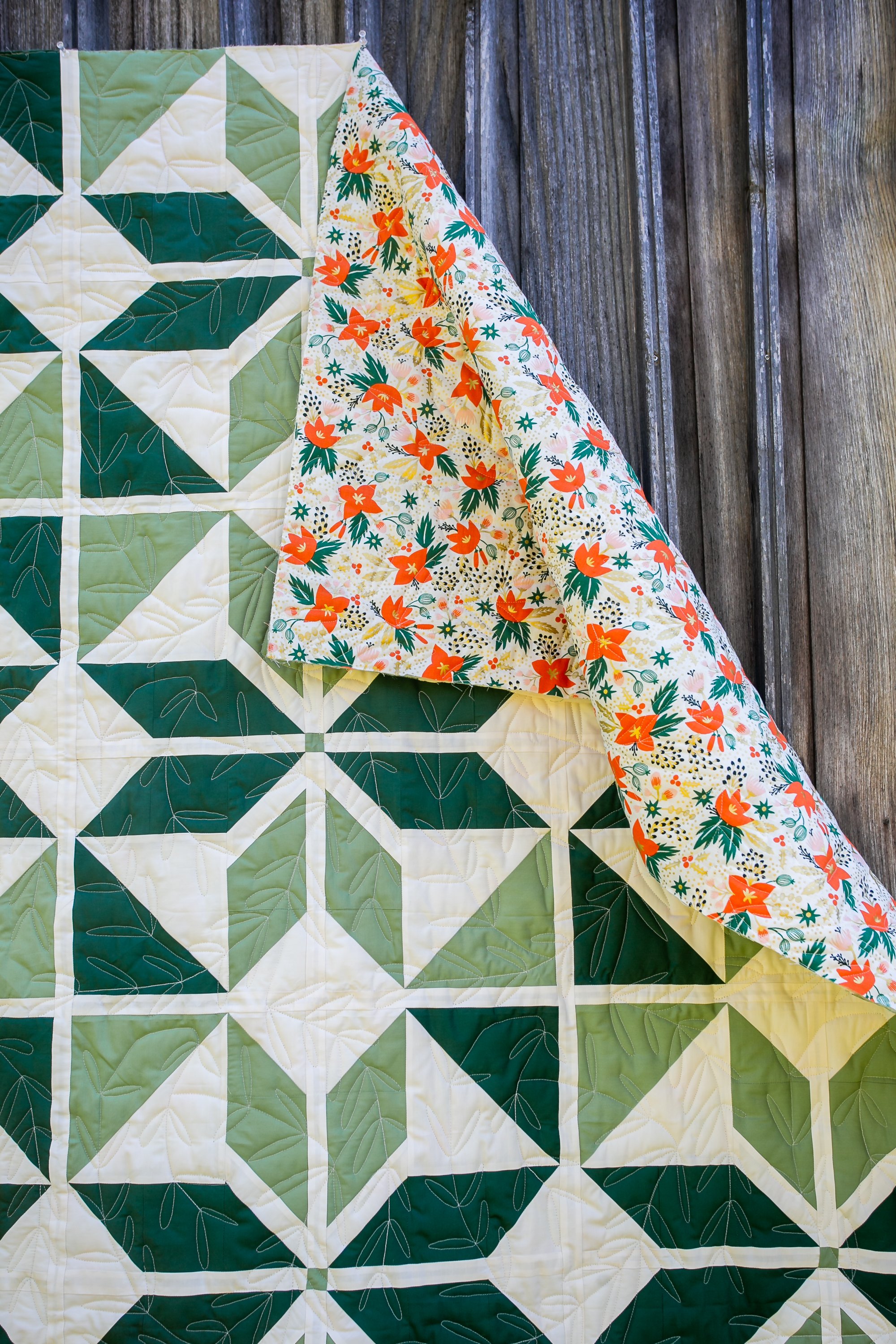
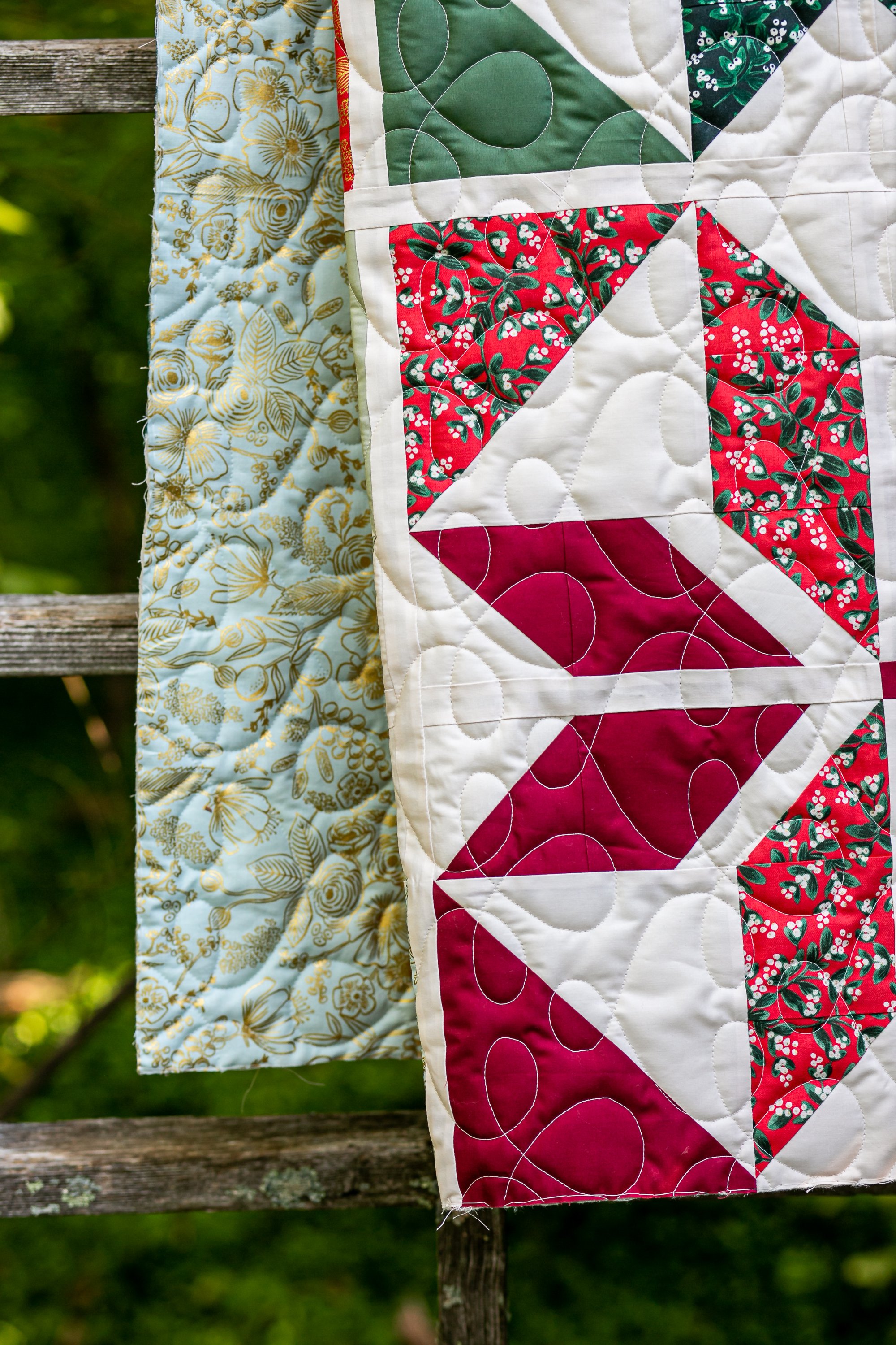
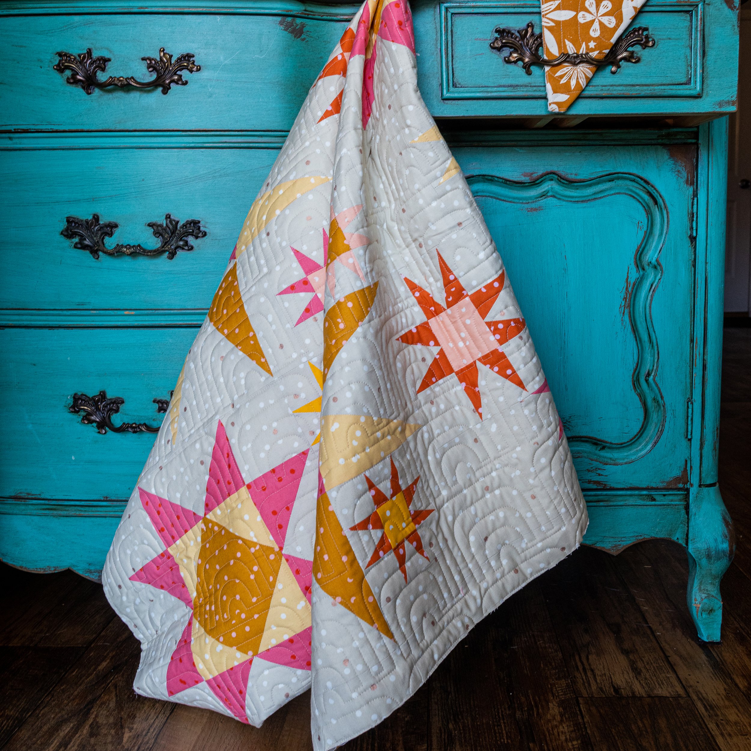
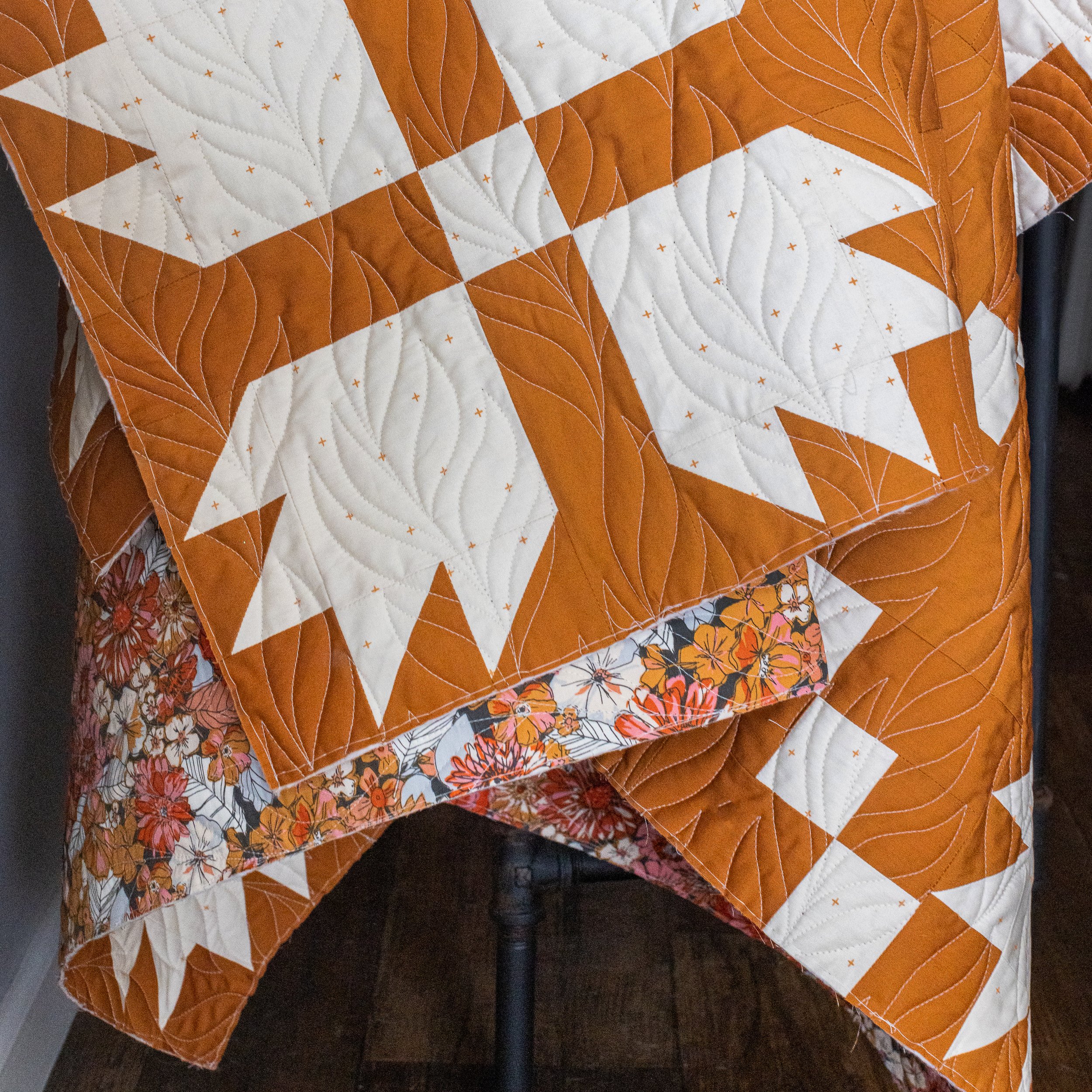
Below are three quilts from the same pattern (Suzy Quilt’s Holiday Party) with different fabrics and different pantos, all using white, off-white, and grey.
Background or Lightest Color In The Quilt
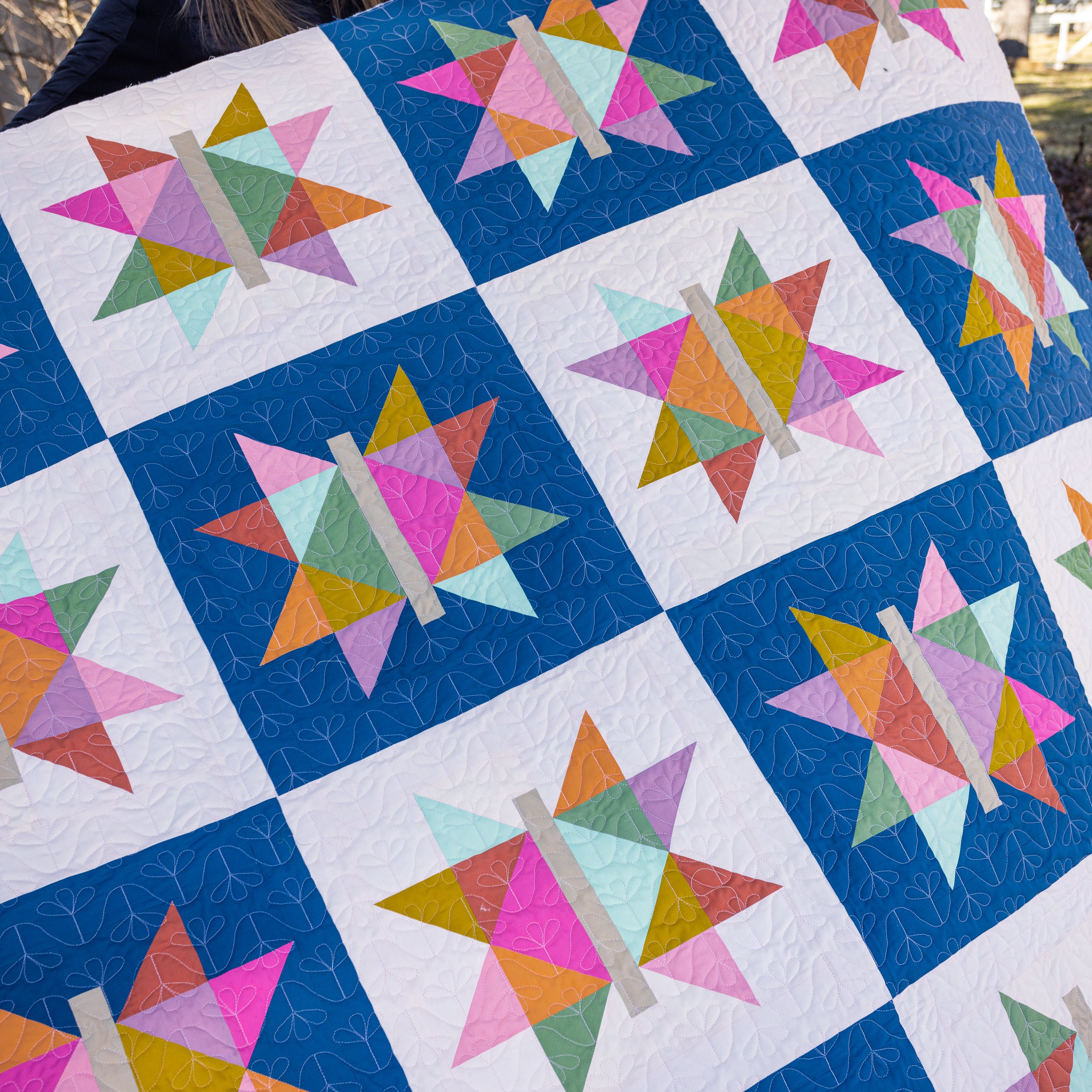
In general, I tend to recommend matching thread to the background color of the quilt. This keeps the background color unbroken and keeps the focus on the colors and patterns of the piecing and fabrics.
If there is no ‘background’ then matching the lightest color in the quilt is a great avenue. I’ve done this many times when picking a thread color for quilts from Donna at XOXSew and I’ve always been pleased with the result, especially as she often has a lot of deep contrasting colors in her quilts.
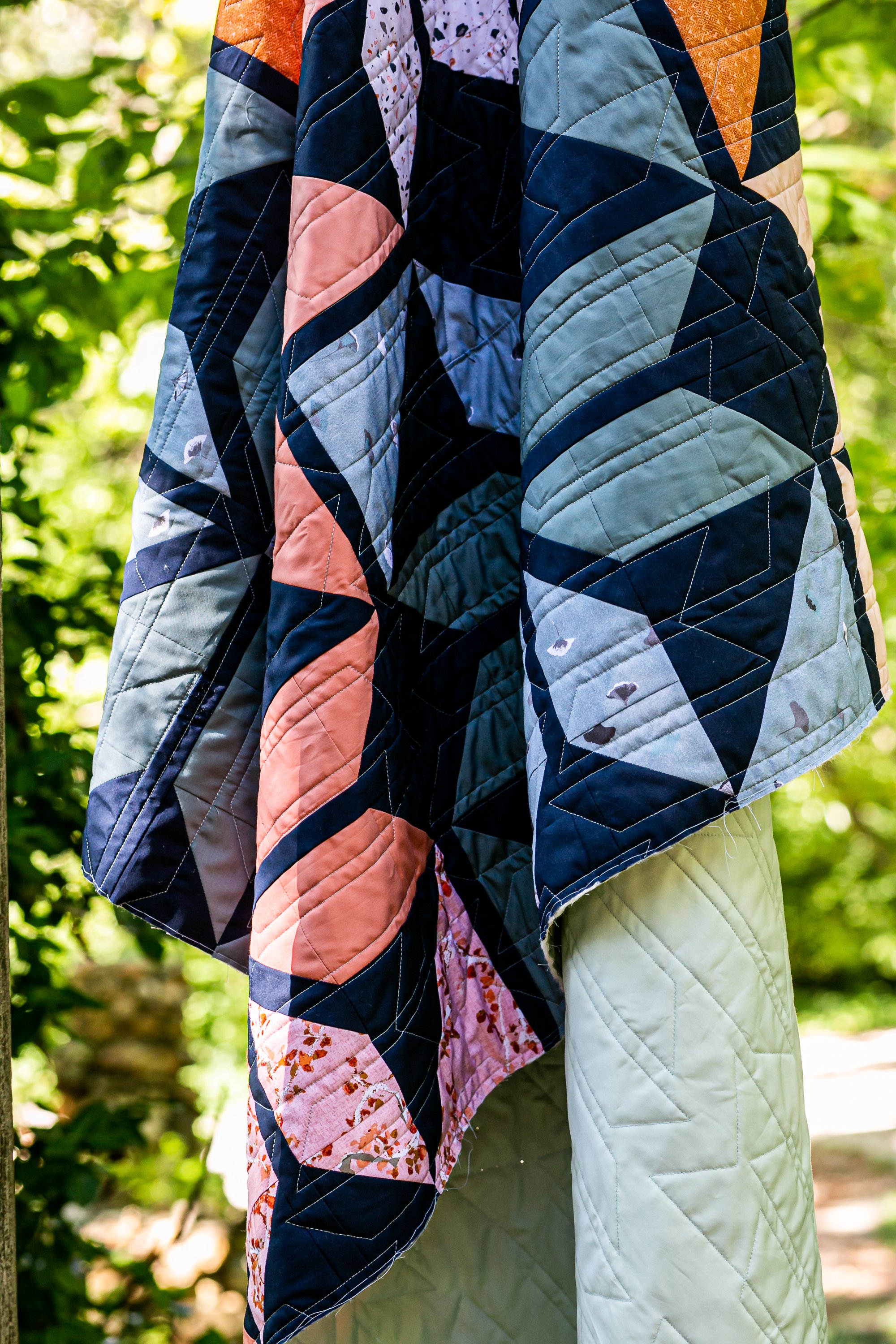
Below is a great collection of quilts where when picking a thread color, we used the background color or the lightest color in the quilt.
Using Color
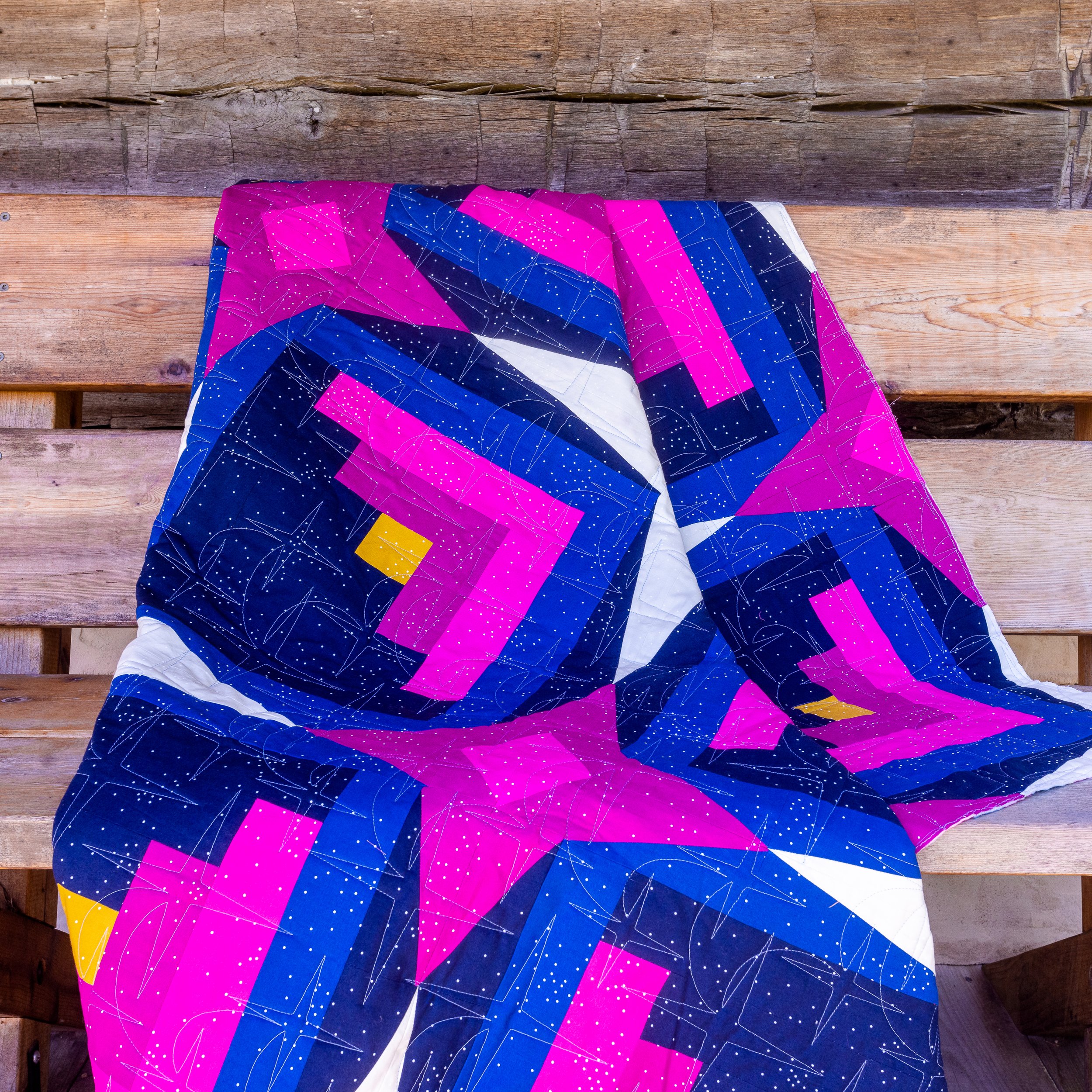
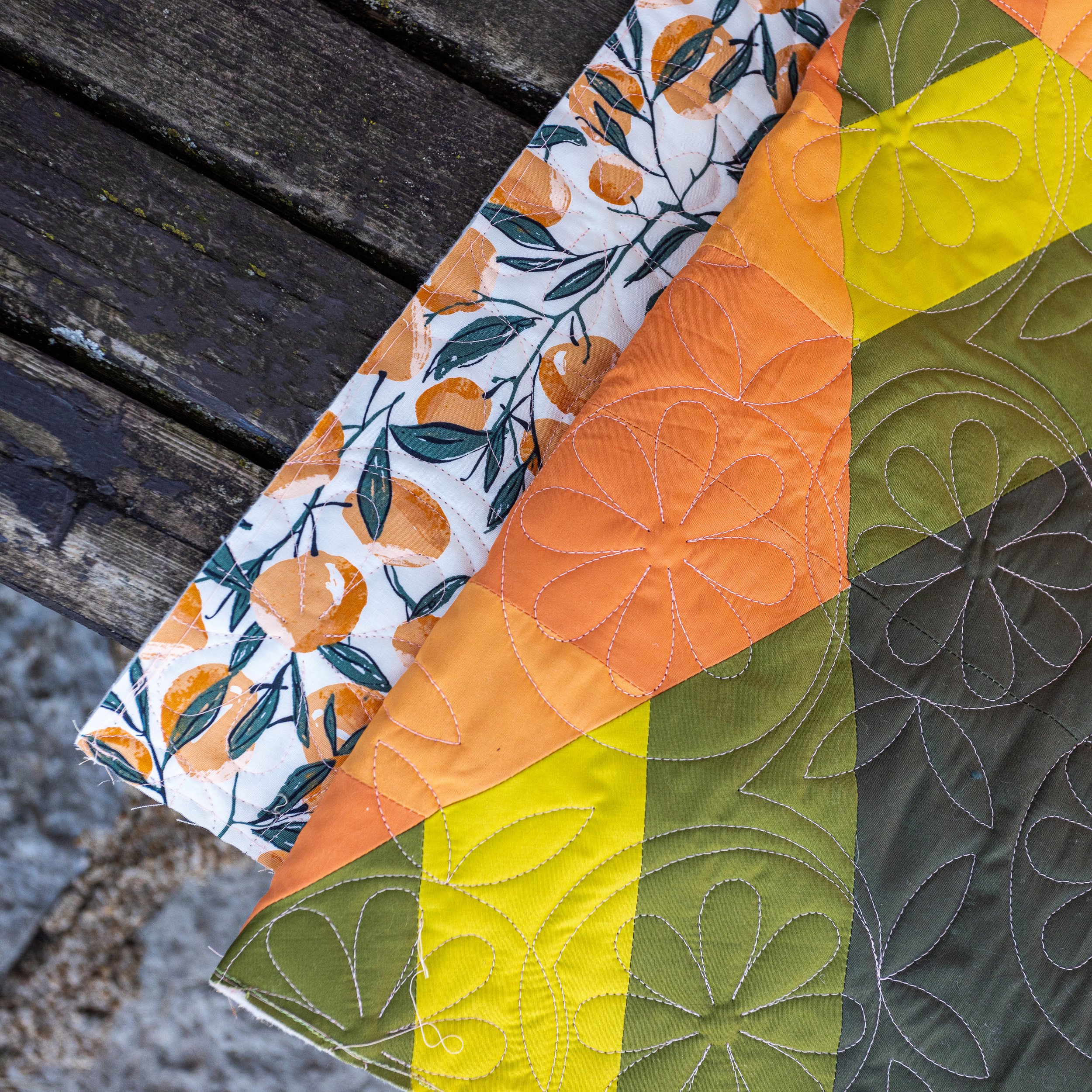
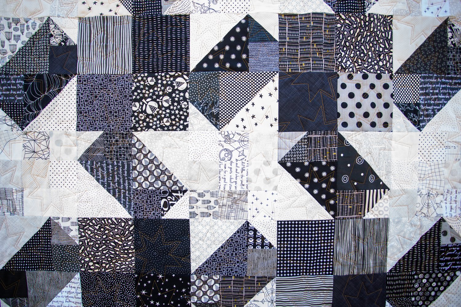
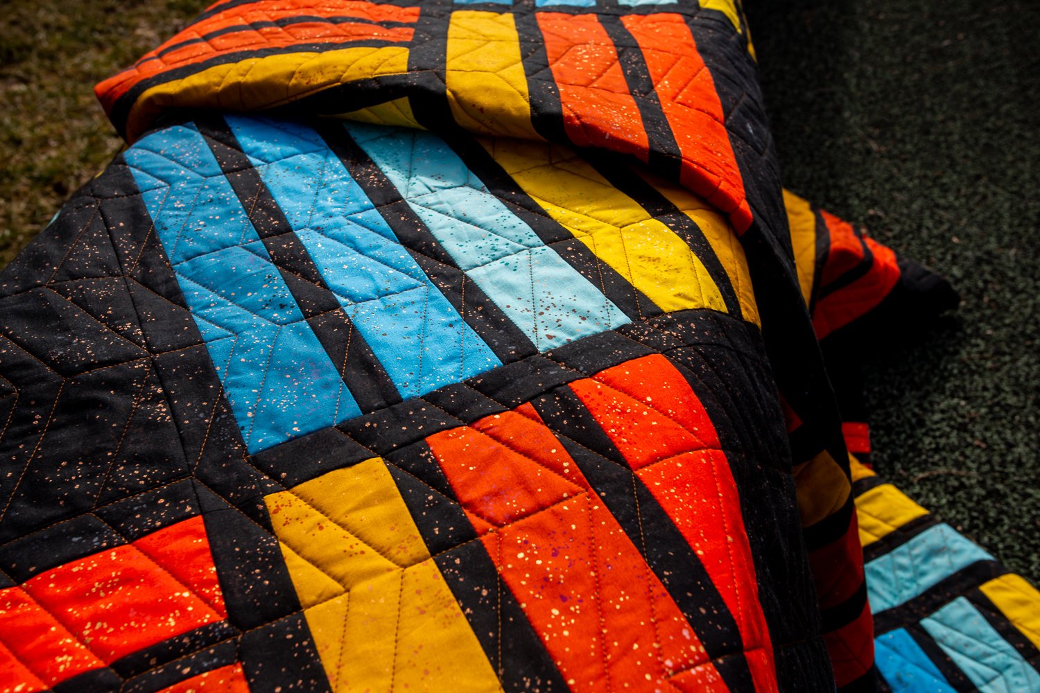
We can also head toward a color that blends a bit everywhere so it doesn’t stand out too much in any given space. A great example would be using appropriately toned gold thread on the Maypole and Blakely quilts below. Unless you go with super contrast, the quilt thread color won’t take over the quilt. A great example is the black and white Starship quilt to the side. We used orange thread and you can see that it adds a very fun pop of color up close without drawing attention away from the quilt itself.
Don’t Forget The Back!
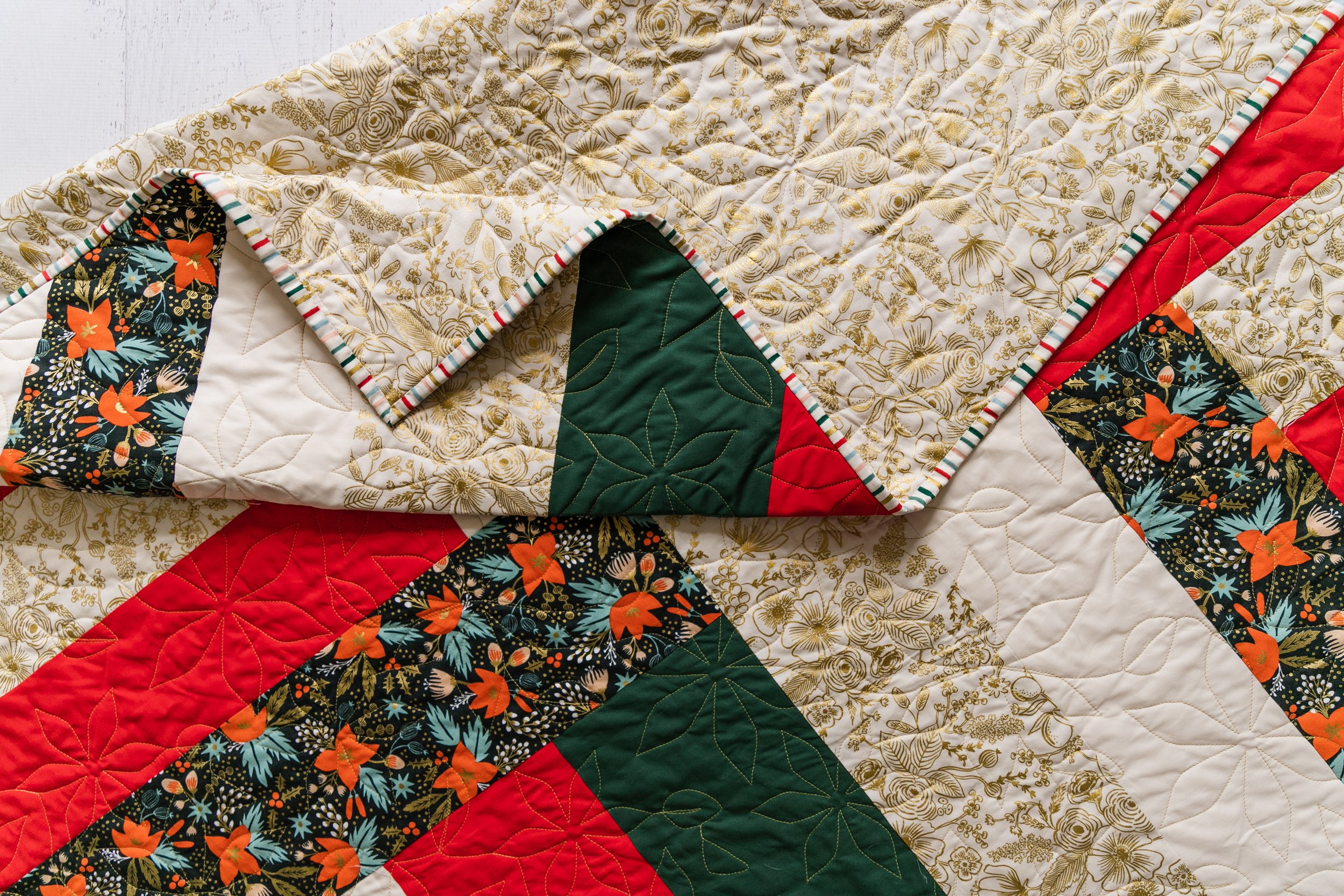
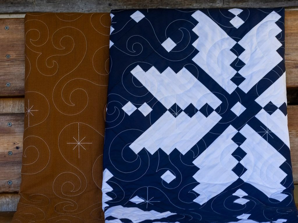
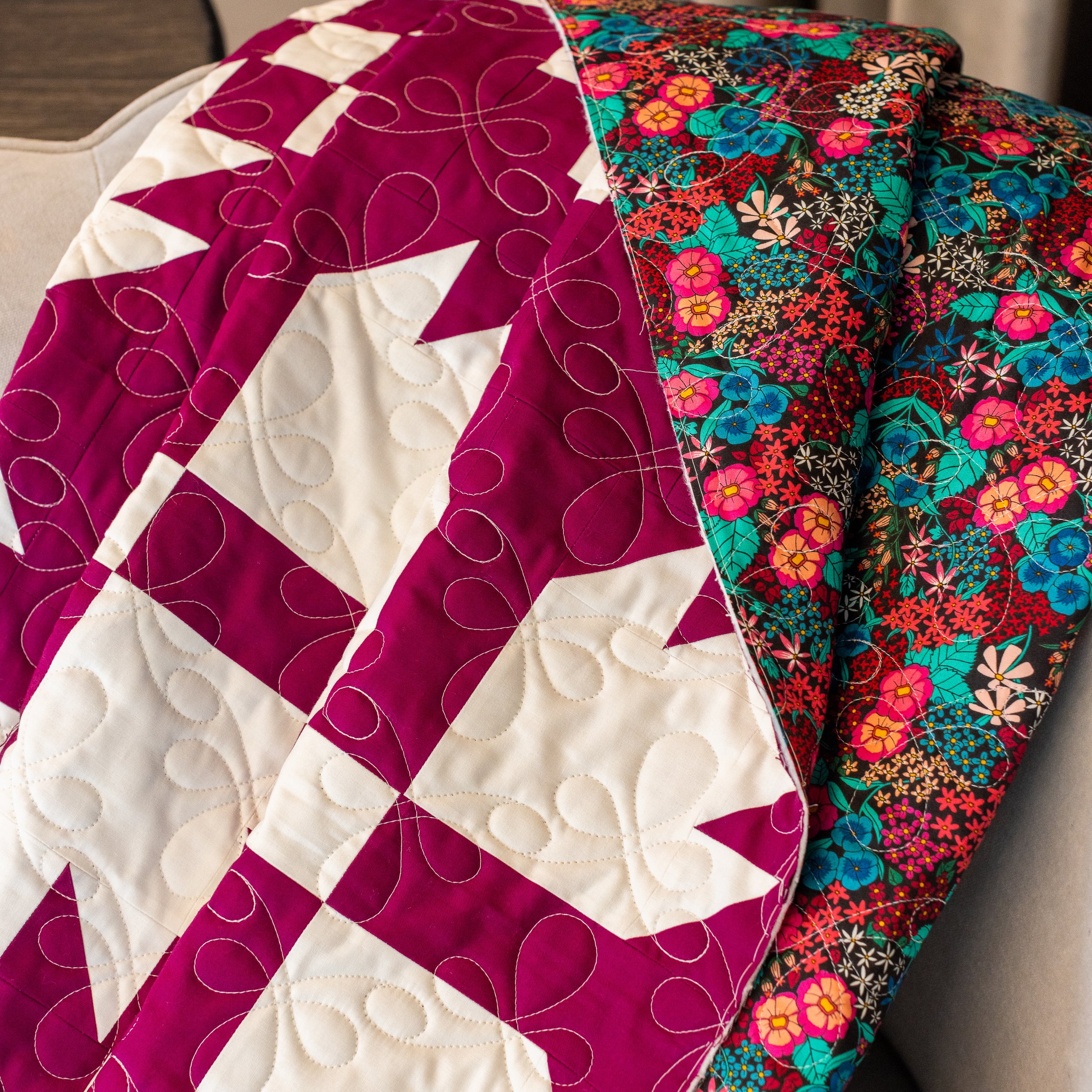
At TCQ we use the same color thread on the top and the back of the quilt. This helps us minimize the appearance and assumption of ‘mistakes’ if one of the colors occasionally pokes through to the wrong side. I think of this as an opportunity; If our focus is to blend on the top of the quilt, then we often have a chance to let the quilting shine on the back. I’ll use this quilt again in the next section, but let’s take a sec to admire how much that white stands out on that quilt back! It’s like a whole extra bonus quilt!
Two Color Quilts
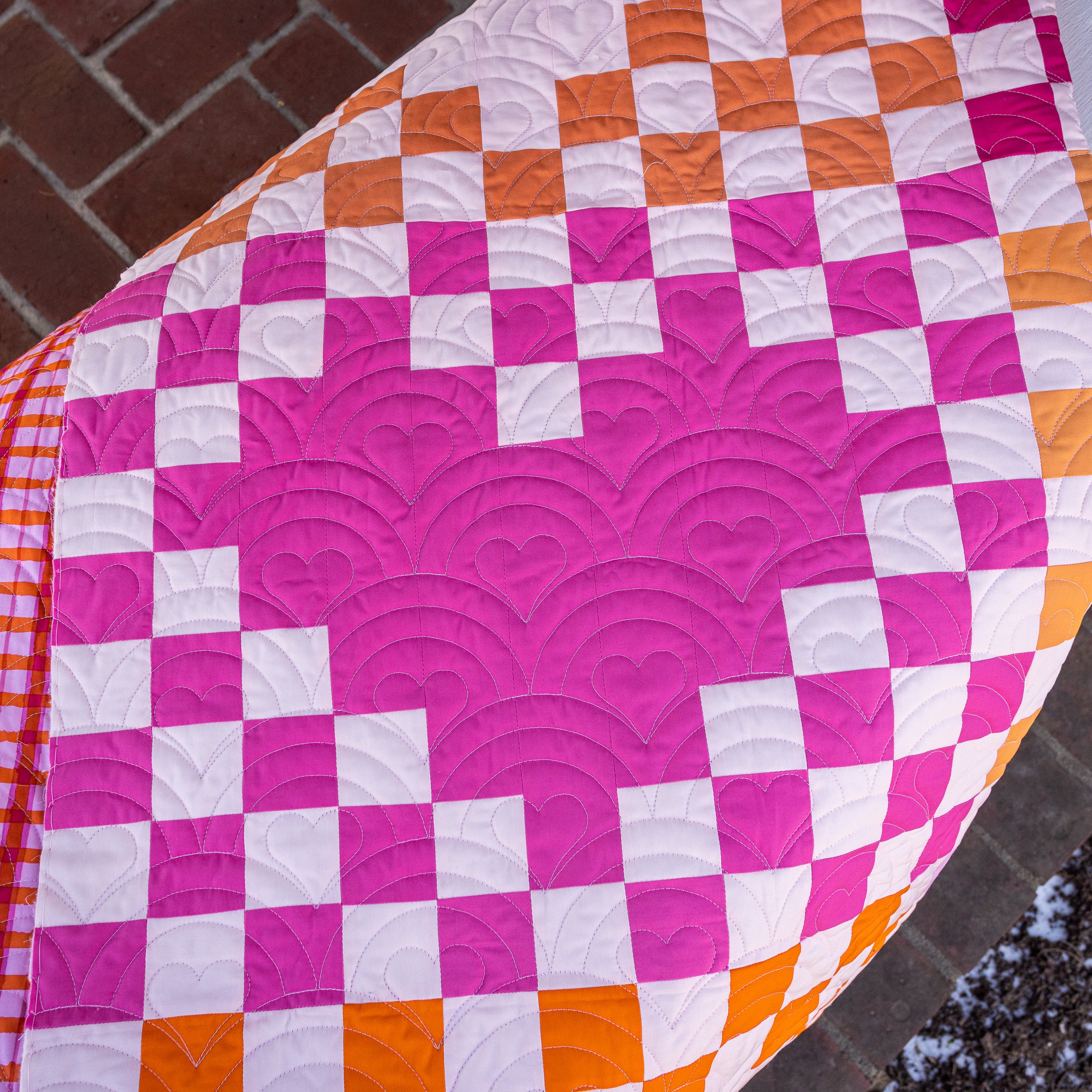
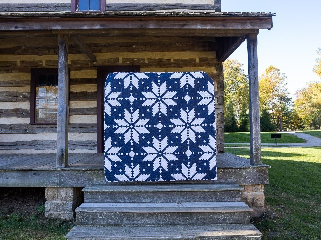
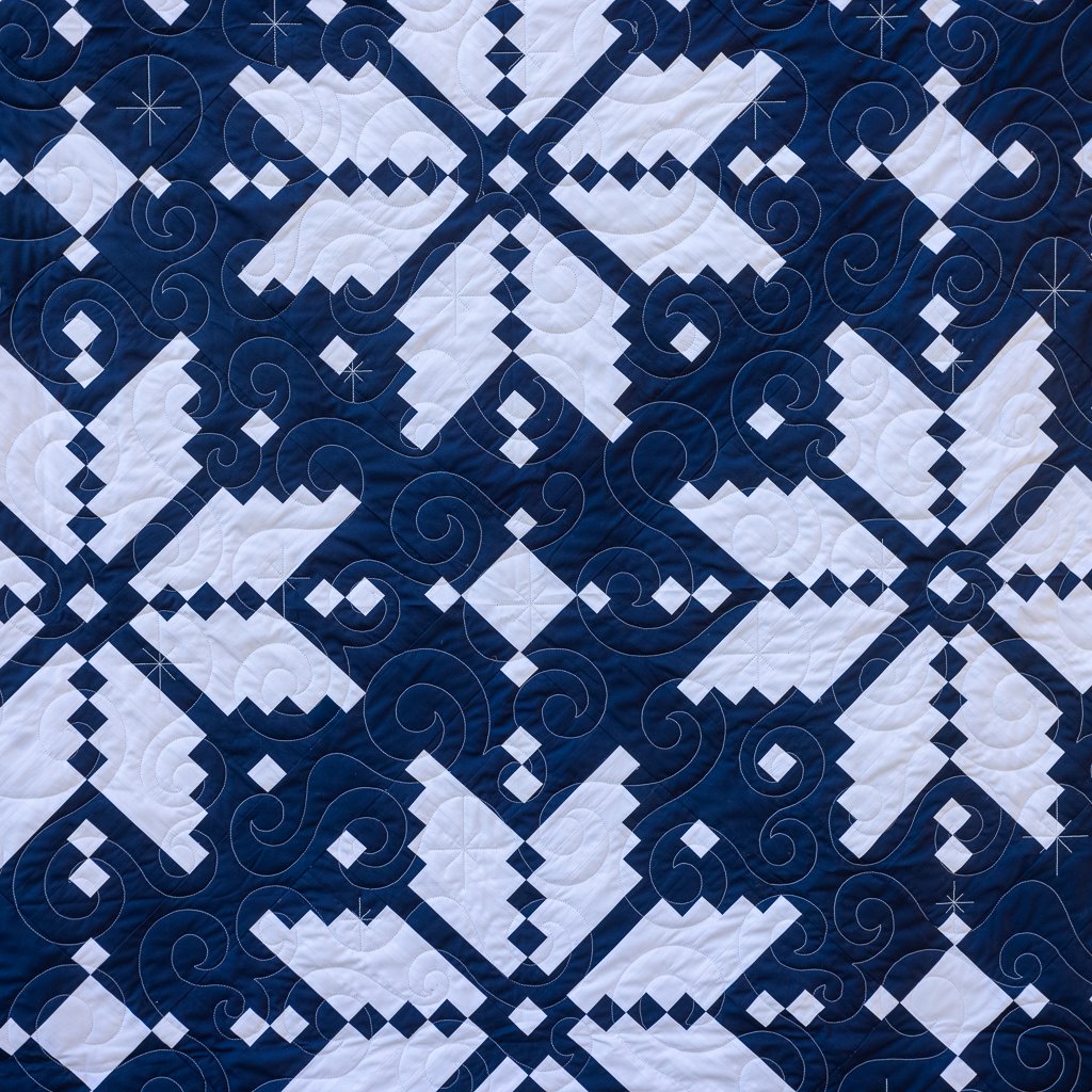
For me, the trickiest quilts are two color quilts with high contrast. No matter what, the thread is going to stand out somewhere. I take these on a case by case basis, though I often fall on the side of using the lightest color. This tends to keep the light colors unbroken and less busy and lets the darker fabric absorb the extra movement.
Whether you decide to go basic with off-white, or let your thread color steal the show, you should now have more confidence in picking a thread color that is right for you and your quilt top. Still unsure or not interested in making the decision? That’s fine - we always love to take on the task for you! Either way, we have every confidence that we can pick just the right color for your top!

